HISTORY
Andreea Mihaiu is a young graphic designer with a MA in Communication Design at The National university of Arts, Bucharest. In 2011-2012 she worked as a graphic design volunteer for PRISPA team, Bucharest, for the international contest Solar Decathlon 2012. Since 2013 she has established a collaboration with the Textile Department of The National University of Art, creating identity materials for international and national contests, and promotional catalogues. The most important part of Andreea's career has been the creating of an Orthodox Gospel Book, project that lasted over an year. Currently she is working in advertising and she is a founder (next to Andra Pavel) of GRAPHO_MAT design and book binding studio for limited edition books, exhibiting at Dizainăr and ROD Cărturești. She won the young designer prize (2012) and the typographic experiment prize (2014) at The Most Beautiful Books in Romania.
ROMANIAN DESIGN WEEK APPEARANCES
2016 // REVIVAL EXHIBITION
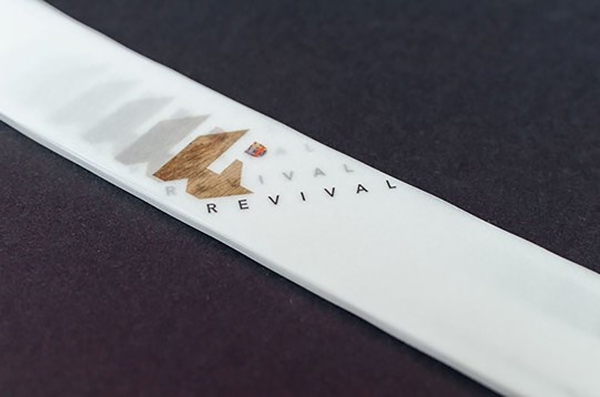
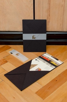
Visual identity for Dorina Horătău (textile designer) personal exhibition, REVIVAL @ Casa Ion Mincu, Bucharest, 2014. After long talks with the artist, it was decided to use the letter R as the exhibition central element, an R that became ornamental, a mix between tradition and contemporanity. Based on the new identity they developed a series of folders describing the event, next to the invitation, outdoor banner, online and print poster and the whole event packaging.
2016 // MARBLED PAPER. MARBLED SKETCHBOOKS
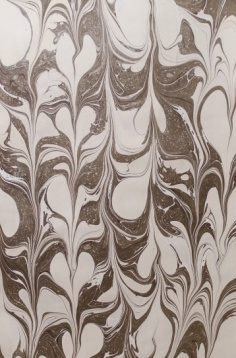
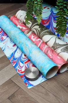
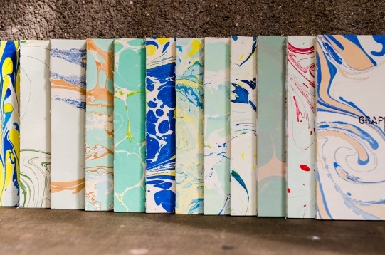
A project that brings to life the marbled paper of 1800. Paper marbling is a method of aqueous surface design, which can produce patterns similar to smooth marble or other stone. The patterns are the result of color floated a viscous solution and then carefully transferred to an absorbent surface, such as paper or fabric. The printed paper is then used as a writing surface for calligraphy, and especially book covers and endpapers in bookbinding and stationery. Part of its appeal is that each print is a unique monotype.
2016 // SCREEN PRINTED SCARVES
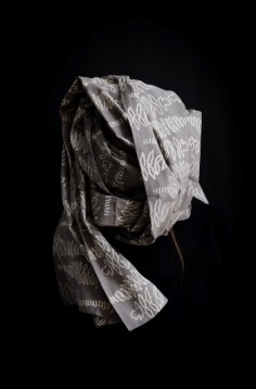
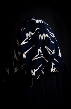
Working with fabric, both aim and challenge were for each team member to relay their graphic style onto textiles through screen printing. The focus was thus set on pattern design and how graphic elements look, feel and behave when applied to a soft, moving surface, as opposed to hard paper or print. The result is a series of patterns, designed to be multipliable and appliable to more than one textile surface. The showcase for this project is the series of screen printed scarves, whereas the patterns are intended for future use such as drapes, home textiles, furniture fabric, fashion and so on.
2015 // The History of Books And Bookbinding
2014 // Way finding system, The National Library
Andreea Mihaiu is a young graphic designer with a MA in Communication Design at The National university of Arts, Bucharest. In 2011-2012 she worked as a graphic design volunteer for PRISPA team, Bucharest, for the international contest Solar Decathlon 2012. Since 2013 she has established a collaboration with the Textile Department of The National University of Art, creating identity materials for international and national contests, and promotional catalogues. The most important part of Andreea's career has been the creating of an Orthodox Gospel Book, project that lasted over an year. Currently she is working in advertising and she is a founder (next to Andra Pavel) of GRAPHO_MAT design and book binding studio for limited edition books, exhibiting at Dizainăr and ROD Cărturești. She won the young designer prize (2012) and the typographic experiment prize (2014) at The Most Beautiful Books in Romania.
ROMANIAN DESIGN WEEK APPEARANCES
2016 // REVIVAL EXHIBITION
Visual identity for Dorina Horătău (textile designer) personal exhibition, REVIVAL @ Casa Ion Mincu, Bucharest, 2014. After long talks with the artist, it was decided to use the letter R as the exhibition central element, an R that became ornamental, a mix between tradition and contemporanity. Based on the new identity they developed a series of folders describing the event, next to the invitation, outdoor banner, online and print poster and the whole event packaging.
2016 // MARBLED PAPER. MARBLED SKETCHBOOKS
A project that brings to life the marbled paper of 1800. Paper marbling is a method of aqueous surface design, which can produce patterns similar to smooth marble or other stone. The patterns are the result of color floated a viscous solution and then carefully transferred to an absorbent surface, such as paper or fabric. The printed paper is then used as a writing surface for calligraphy, and especially book covers and endpapers in bookbinding and stationery. Part of its appeal is that each print is a unique monotype.
2016 // SCREEN PRINTED SCARVES
Working with fabric, both aim and challenge were for each team member to relay their graphic style onto textiles through screen printing. The focus was thus set on pattern design and how graphic elements look, feel and behave when applied to a soft, moving surface, as opposed to hard paper or print. The result is a series of patterns, designed to be multipliable and appliable to more than one textile surface. The showcase for this project is the series of screen printed scarves, whereas the patterns are intended for future use such as drapes, home textiles, furniture fabric, fashion and so on.
2015 // The History of Books And Bookbinding
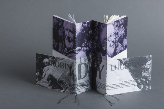
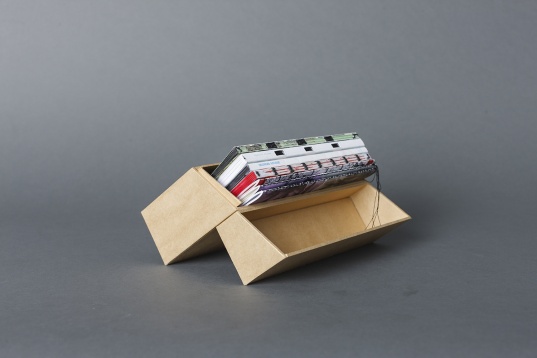
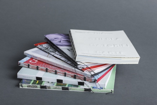
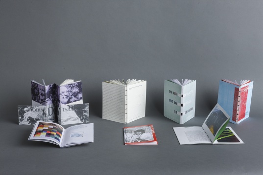
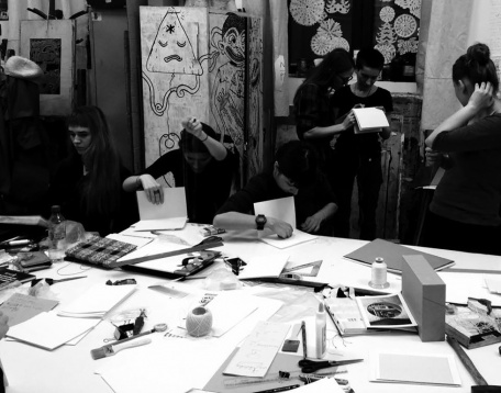
The history of books and bookbinding is the main book from the Architecture of books, containing six more artist books that show the perfect relation between type, lay-out, architecture, exterior - interior etc. Its content is based on the history of bookbinding, the morphology of books, bookbind-ing steps, techniques and tools. All seven books are created on the same grid and have the same size. The binding and typography is different, being related to the type of subject and each artist vision of the world.
2014 // Way finding system, The National Library
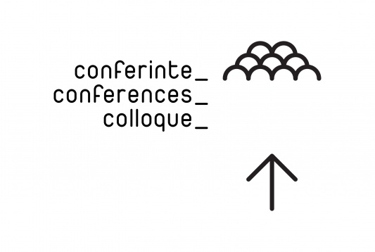
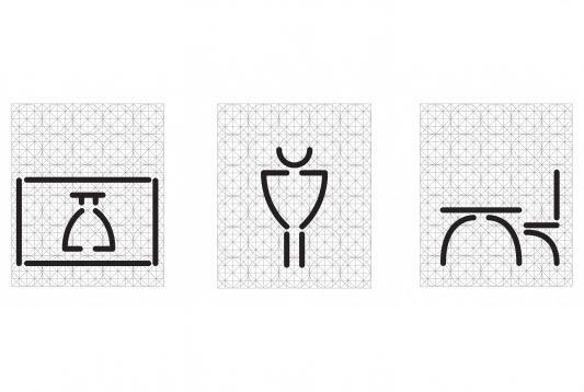
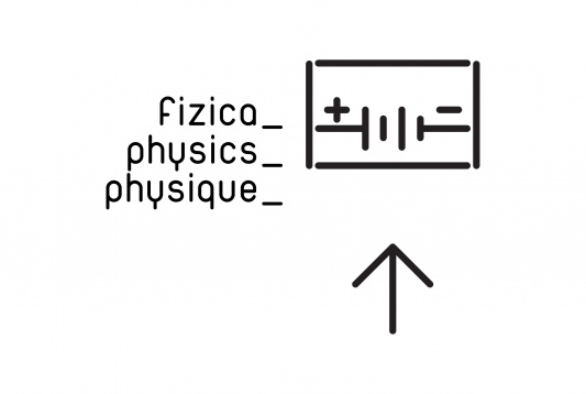
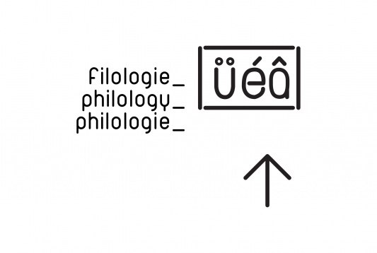
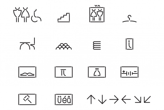
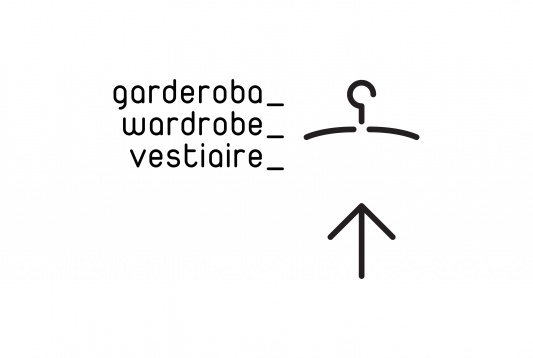
The National Library is the largest library in Romania. In 2009 the rehabilitation work started and in 2012 the cultural space had been opened for public. She started working at this project in october, 2013. But before this, she had two mounths for documenting the space, its new architecture, light and surroundings. structuralism, geometry, volumetry. The interior is a combination of lots of materials, textures, surfaces. So she started with all these in mind, and developed a system based on a basic metric grid, with liniar shapes but with round terminations, like a skelet. Many shapes are taken from the duepuntozero type features, and adapted on the metric grid. There is an interesting play between type and icon. A specific place is written in 3 languages dinamic and flexible way. Both elements (type and icons) use the duepuntozero font, icons being seen here like dingbats from this font. Moreover, the interior architecture is divided in two: dark spaces and bright spaces, which made her develop two types of mapping the icons: in the bright spaces she used neutral black self-adhesive for a higher contrast (low cost is very important here, to make room for a bit more expensive mapping for the dark spaces), and in the dark spaces she used neon tubes to enlighten the way to a specific room, a white light which is the reversed of the bright space.


