HISTORY
ROMANIAN DESIGN WEEK APPEARANCE
2017// Van fruct
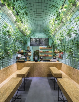
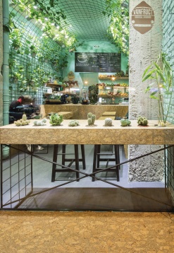
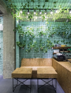
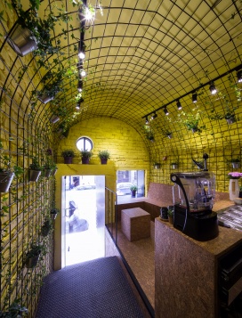
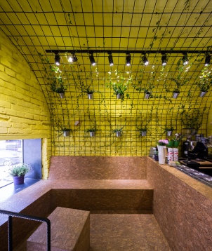
The interior designs were meant to be efficient and have a tonic feel, communicating the brand’s profile. Each new location had to have a specific pastel color (VanFruct Mendeleev –lemon yellow, VanFruct Câmpineanu –mint green). Each space is visually unified by a transparent metal mesh arcade, suggesting vine canopy vaults and at the same time the inside of a van. The brands name, profile and long spaces led to this idea. Plant pots with aromatic plants and indoor ivy were hanged by the mesh. Both designs took place in difficult, narrow locations, with passing through spaces. This resulted in dividing the space into two distinct areas: the active, passing through area and the passive, sitting down and relaxing area. The sitting areas were covered in cork, a warm and soft material that goes with plants and fresh fruity drinks. Walls were uncovered, leaving the brick expose, and then colored with lemon-yellow/mint-green.
2016 // POINT
In order to increase the height and the perception of the rooms, they chose to reveal the roof structure by adding the attic height to the first floor space. We kept the original layout of the floor plans, trying to adapt our proposal as much as possible to the character of the existing space.
LAMA ARHITECTURA was born out of the common passion for architecture of two young architects, Călin Radu and Dan Enache. With different ways of thinking but with the same vision, the two architects are always trying to find the most natural approach to context and design theme, be it architecture or interior design. They belive in niches and people passionate about what they do, in freedom of expression and experiment.
2017// Van fruct
The interior designs were meant to be efficient and have a tonic feel, communicating the brand’s profile. Each new location had to have a specific pastel color (VanFruct Mendeleev –lemon yellow, VanFruct Câmpineanu –mint green). Each space is visually unified by a transparent metal mesh arcade, suggesting vine canopy vaults and at the same time the inside of a van. The brands name, profile and long spaces led to this idea. Plant pots with aromatic plants and indoor ivy were hanged by the mesh. Both designs took place in difficult, narrow locations, with passing through spaces. This resulted in dividing the space into two distinct areas: the active, passing through area and the passive, sitting down and relaxing area. The sitting areas were covered in cork, a warm and soft material that goes with plants and fresh fruity drinks. Walls were uncovered, leaving the brick expose, and then colored with lemon-yellow/mint-green.
2016 // POINT
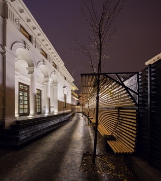
This independent theater positions itself on a site with great personality, defining it, awakening memories. By doing so, it helps reviving that specific urban area.The 19th century house that now hosts the POINT project was consolidated, restored, extended and mansard-roofed. Therefore, the house comprises of a basement, a ground floor and a mansard roof. Aditionaly, the property holds a long and narrow yard that develops along two sides of the building.
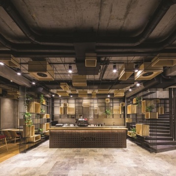
The start-up for this project was the pixel (POINT) concept. We used the pixel as a unit of measurement (module), thus generating a series of modular and multifunctional objects that helped obtain flexibility. These ended up enveloping and visually unifying the whole space, whilst separating and outlining certain areas.
The ground floor has the function of a foyer and is also able to host cultural events all by itself. The basement works as a bar/club and sometimes as a performance room for someregarding the context and design theme, whether it’s architecture or interior design. LAMA sup-ports niches and people that are passionate about what they do. It belives in the freedom of expression and the experimental, in the power of a team and the normality generated by careful thinking.
2016// TED'S COFFEE
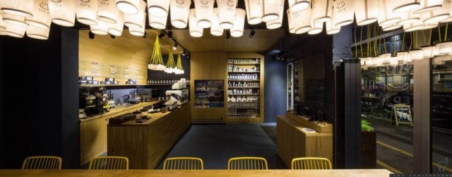
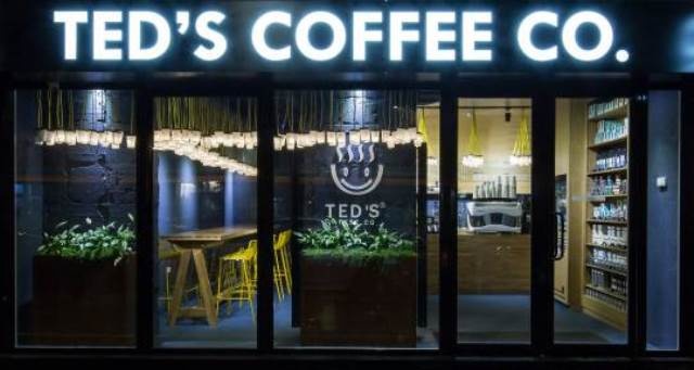
Ted's Coffee Co. franchise wanted a new image, in four different locations, projects that were carried out simultaneously. The project is located in the University square, at the ground floor of a residential building with an important pedestrian street view. In addition, the café features an outdoor terrace. Lama wanted a warm and recognizable image. Thus, the concept has remained similar for all four locations - creating an active zone - the quick sale and traffic "to go" zone, with a passive, relaxing zone. In this framework, the use of curved metal ceiling above the bar and the integrated lighting installations created by re-used "to-go" coffee cups arrangements with several sizes, have created a warm note cafe. The furniture and walls finishing was chosen to bring a touch of color to the place.
The warm feeling grows inside the coffeeshop, given the warm wood used for the floors, next to the screed flooring used for the shop area.
The restaurant is divided into two different traffic zones, which do not compete with one another, although intertwined. The layout separation of the active, "to go" zone, with the “passive”, relaxed zone, allows customers to relax while drinking coffee and not be disturbed by passing customers.
2015 // Shift Restaurant
The idea behind The Shift Restaurant was to obtain an interior space that would be an extension of the existing garden.
Situated in the center of Bucharest, in a protected area with old buildings from the 19th century, the house that holds this restaurant consists of aground floor, first floor and attic. The masonry wall type of the structurewas combined withthe wooden structures of thefloors and roof.
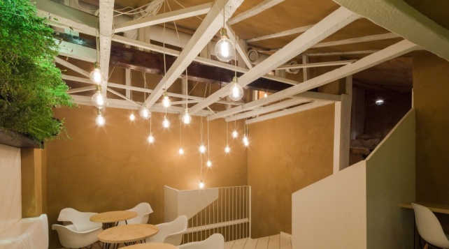
In order to increase the height and the perception of the rooms, they chose to reveal the roof structure by adding the attic height to the first floor space. We kept the original layout of the floor plans, trying to adapt our proposal as much as possible to the character of the existing space.
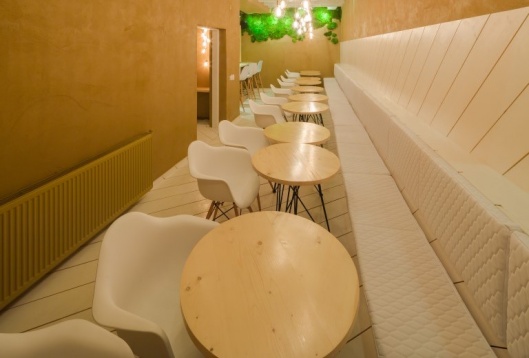
The old brick walls were plastered with 100% natural clay as used in ecological architecture. The remaining existing elements were finished with materials inspired by nature. Woodwas usedfor the floors, walls and furniture, and mounted diagonally to clear imperfections and unparallelfeatures of the old house. This alsoprovided fluency for the elements intersections. The textures of the boards placed on different directions remindus of the variety of lines found in the garden. We used slate in the hallway for both walls and flooring,as to provide a gradual transition towards the inside,from the stone paved courtyard. Metal was chosen for the structural finesse and used for the base ofthetables and chairs.
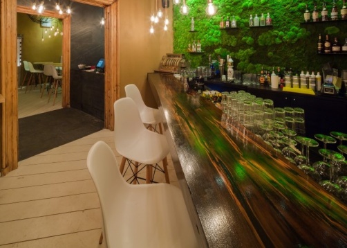
The lighting design also had it’s concept derived from the visual theme of the garden.The textile cable arrangement area reference to the bodies of climbing plants found in the garden. We used Edison bulbs, finding them appropriate for the era in which the house was built. The bulbs are realeased as musical notes from the brass instruments used as chandeliers.
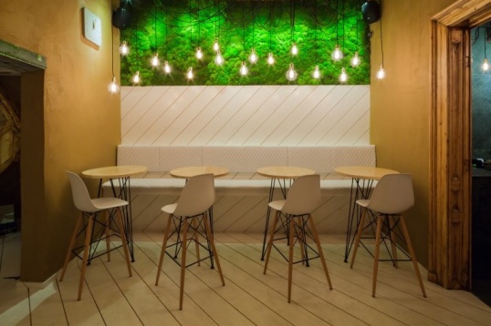
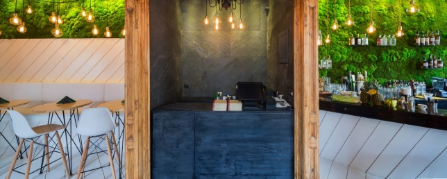
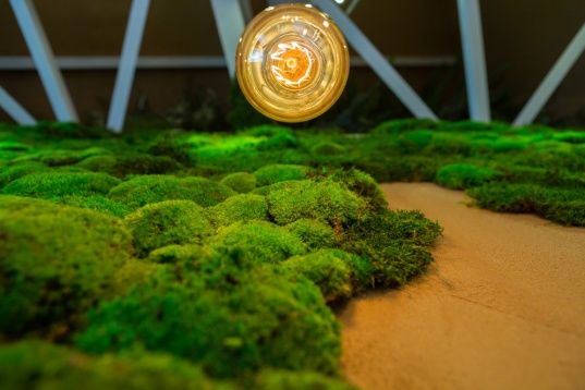
The theme of bringing nature inside was also obtained directly, by using natural moss for dressing some of the walls and allowing them to become miniature fields.


