HISTORY
Graphic designer specialized in branding, editorial design, custom lettering, with a special interest in traditional printmaking techniques. She was the art director of Omagiu between 2007-2010, a magazine dedicated to contemporary arts & culture where she innovated through illustrated custom type work. In 2007 she was one of the ten up-and-coming designers selected for a showcase in the Editorial Pro category at the Colophon Luxembourg / International Magazine Symposium. During 2009 she attended the International Summer Academy of Fine Arts in Salzburg where she studied traditional print techniques.
SPECIFIC
Her main influences are Dutch and Swiss design. She is particularly interested in allowing daily random anecdotes to sneak into the work and influence the crafting process, the ephemeral and randomness of life that can somehow be frozen in time on a piece of paper or otherwise disappear and be forgotten.
“What I meant to say was that I’m not interested in precision or the absolute beauty but the intuitive approach and the fact that I can allow casual mistakes to structure my work, to become a relevant part of it. My work becomes more valuable to myself and others if I let life talk through it. I like to engage elements of chance, random happenings in the construction of my work. It is the stream of consciousness, doors that keep opening as you enter more doors. You can’t see the finish line yet nor the starting point you left behind but somehow you feel it’s leading you to the right place.” Interview for Typopassage, 2011
ROMANIAN DESIGN WEEK APPEARANCES
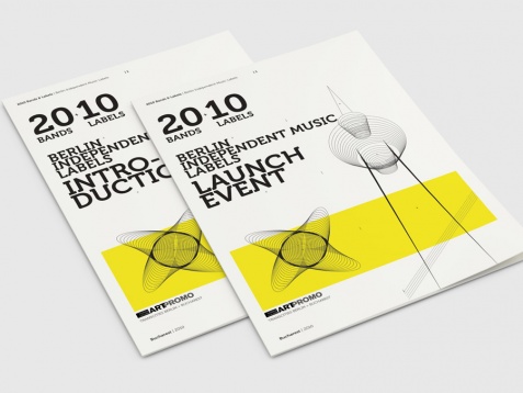
2013 // IDENTITY AND COMMUNICATION DESIGN FOR BANDS&LABELS
Identity project done for an original music event bringing together a number of independent music labels from Berlin.
ROMANIAN DESIGN WEEK APPEARANCES
2013 // IDENTITY AND COMMUNICATION DESIGN FOR BANDS&LABELS
Identity project done for an original music event bringing together a number of independent music labels from Berlin.
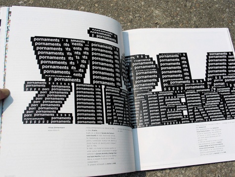
2013 // CUSTOM LETTERING FOR OMAGIU MAGAZINE
This is a personalized graphic solution that involves the graphic treatment of type and letters through a combination of various techniques: hand-drawing, bricollage, watercolour and computer vector. Its main purpose is to visually enhance a text or headline giving it a unique look and feel.
This is a personalized graphic solution that involves the graphic treatment of type and letters through a combination of various techniques: hand-drawing, bricollage, watercolour and computer vector. Its main purpose is to visually enhance a text or headline giving it a unique look and feel.
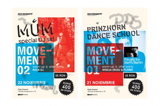
2013 // IDENTITY AND COMMUNICATION DESIGN FOR MOVEMENT
Movement is an initiative focused on music events. A black ribbon arranged in the shape of letters was used as a starting point for the logo design in order to suggest movement and versatility. Further on, the visual solution features blue and red shifting platforms merging and separating at the same time to create the effect of movement.
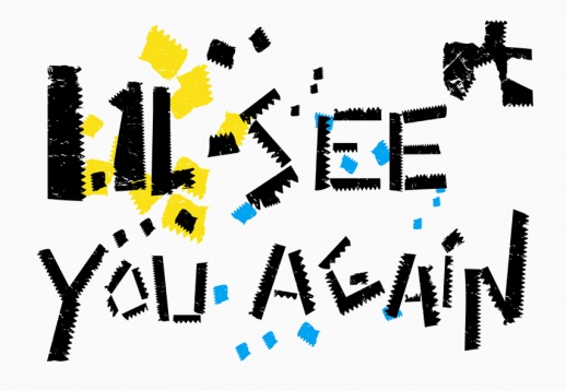
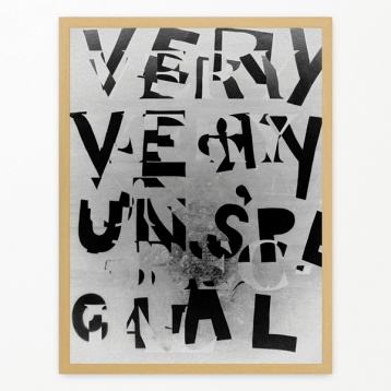
2013 // CUSTOM LETTERING using bits and pieces of wrap paper in a digital environment.
2013 // TYPOGRAPHIC POSTER using cutout paper letters and photographic impression.


