HISTORY
Sorin Trăistaru is an independent lettering artist and calligraphy enthusiast based in Bucharest. For the past 5 years, he has been holding calligraphy workshops, spreading the love for letters to over 400 people.
SPECIFIC
His work is a continuous play with inks, paper or pixels and varies from clean and smooth letters to messy and expressive strokes. His projects are inspired by everyday news, personal experiences, unexpected encounters, and he always keeps an eye on social and political events.
ROMANIAN DESIGN WEEK APPEARANCES
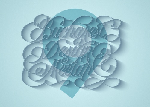
2019 // Bucharest Design Meetup 9
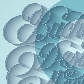
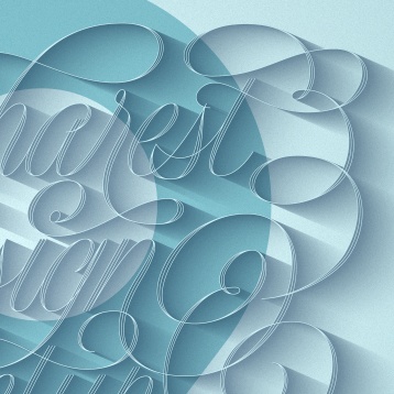
The ninth edition of Bucharest Design Meetup, a monthly, informal beer gathering with designers specialized in different areas of expertise got this custom made lettering for it's June edition. Every month a new designer's work is showcased within a micro-exhibition, and for this edition, Sorin Trăistaru's lettering works were selected. It was up to him to create a visual that spoke the best of his craft and so, this carefully drawn, tangled lettering became the image of June's event. All the letterers and flourishes were carefully drawn on paper through a long and tedious process of iterations and after that, they were redrawn and tweaked as vectors. The flourishes were inspired by the amazing works of George Bickham from The Universal Penman, one of the most influential books on calligraphic flourishing, originally published in 1733.
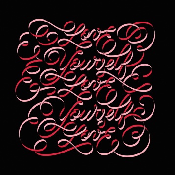
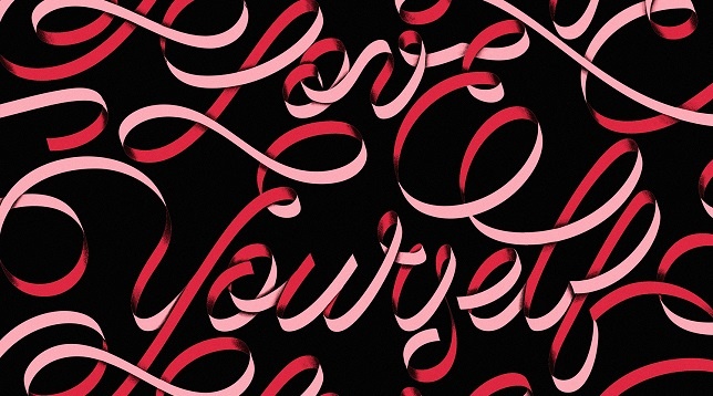
2019 // Love Yourself
Every Tuesday, Goodtype organizes on Instagram a challenge where illustrators and lettering artists are invited to letter in 24 hours a specific phrase or word. During February 2018, the challenge was to letter "Love yourself". Self-loving and self-acceptance can be difficult to achieve and from this very specific reason, this lettering piece shows a quite hard to read (but hopefully effective) mantra that keeps going on and on. Given the small amount of time for this challenge, the letters were drawn entirely on a PC, but with a hint of traditional calligraphy and flourishing in mind.
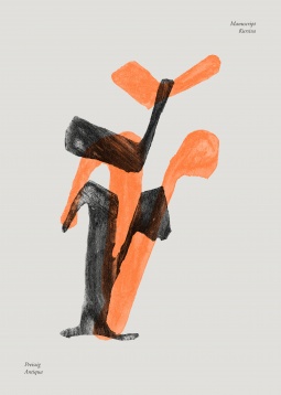
2019 // řř
řř is a poster designed for CzechImage, a poster design competition held by Bucharest Czech Center in late 2018. Following a typographic approach, the poster shows two ř letters. The reason behind this choice is that the letter ř is unique to the Czech alphabet. Looking back in history for the first Czech type designers and trying to understand how they managed to work with diacritic marks, two names stood out: Oldřich Menhart and Vojtěch Preissig, and Veronika Burian‘s dissertation for the Master of Arts in Typeface Design at The University of Reading was a huge source of inspiration for this poster, providing a lot of useful insights. The technique behind the poster is pretty simple and involves tracing two ř's, one made by Menhart and the other by Preissig, engraving, and lino printing them. Linoprinting is also a throwback to the masters of the past, being a common technique used at the beginning of the 20th century. The colors are also inspired by one of Menhart's designs.


