HISTORY
ateliercetrei, written in one word in lowercase letters, is a partnership practicing architecture, interior architecture, design, urban planning and cultural analysis trying to bring together academia, design research and professional practice. The practice is led by two partners in charge of the different ongoing projects: Anamaria Moldovan and Paul-Mihai Moldovan.
SPECIFIC
The one word stands for unity, while the lowercase letters are meant to offer a nod to the Bauhaus notion of a non-hierarchical language,
reinforcing their ethos of democratic partnership.
ROMANIAN DESIGN WEEK APPEARANCES
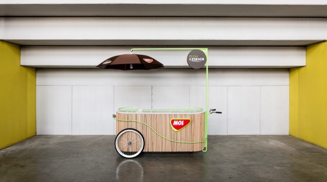
2019 // MOL Fresh Corner Mobile bars
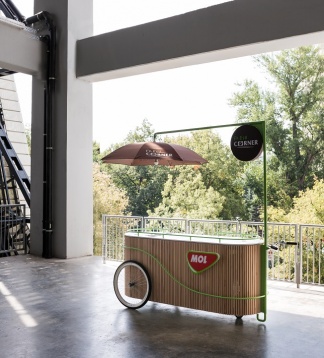
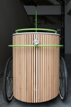
Mol Fresh Corner Mobile bars are part of an expansion strategy of the Fresh Corner concept - the retail component of MOL gas stations that focuses on gastronomy and groceries - targeting music and film festivals as well as street food festivals. Our design thus draws its inspiration from street food culture and from design elements of the two wheels urban means of transport. The bars, suitable for both outdoor and indoor use, are composed of two elements: a pill shaped bar and a steering mechanism.
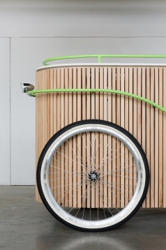
The bar is built around a steel structure enveloped in beech baguettes and covered with a solid surface material countertop. It is fitted with built-in cabinets, all-around crash bars, functional two 26" 36-spoked wheels with whitewall tires, a functional chrome dynamo headlight and a branding light box.
The steering mechanism features a functional handlebar complete with grips and a bike bell, an adjustable shading system that doubles down as a luminaire, and is fitted with a light box.
2018 // ALA Notary Office
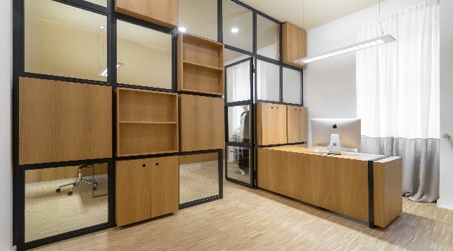
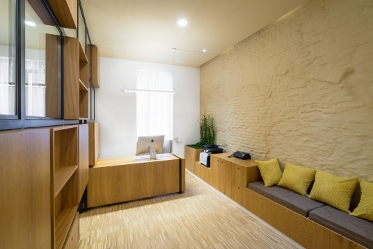
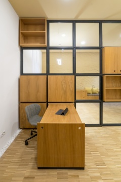
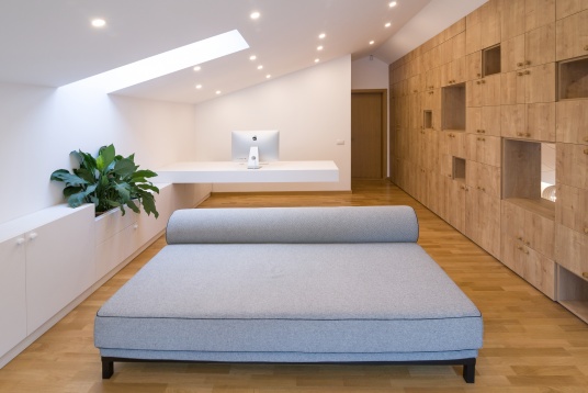
ALA Notary’s Office ambition is to differ from the usual desired opulence of one’s typical notary and law office interior architecture. Its interior, dominated by simple yet elegant custom made oak veneered furniture, revolves around the partially glazed wall that separates the two main spaces of the program: the notary’s office and the waiting room. The glazed wall is pierced by storage boxes and by the secretary's desk which, if needed, extends intro the notary’s office in order to accommodate the typist.
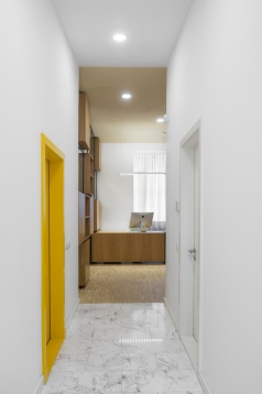
The forced perspective corridor that leads to and from the waiting area gives the illusion that the spaces are twice as closer from the entrance and twice as farther from the exit. This Po-Mo type of irony is continued in the small toilet which has its walls covered in sumptuous Carrara marble.
2018 // LAC House
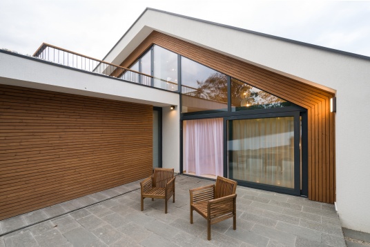
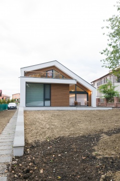
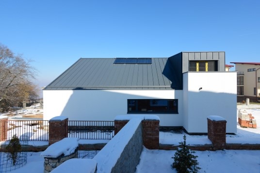
The project follows the transformation of a structure designed for a bachelor in a home for a young family. The challenge was to propose a type of intervention that reduces, through elimination, the existing structure to its volumetric essence and, later, to add functions and their corresponding volumes in the same spirit. The house thus becomes an 'apparatus' that mediates the transition from public space and public life to private space and public life being defined by the two main facades.
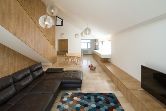
The relationship with the street is mediated by a facade dominated by a dent announcing the entrance, a ‘carved’ entrance with the purpose of announcing the warmth of the house. The relationship with the garden is mediated by a glazed facade that transforms the living-room in an extension of the garden and vice versa. The interiors revolve around the ample living-room, a space that unfolds on two stories and thus intermediates the dialogue ground floor-second floor and house-garden.
2017 // POLY TABLE
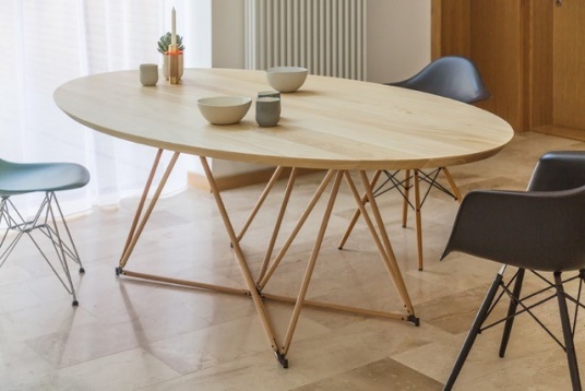
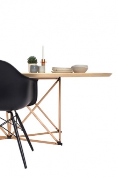
PolyTable is an object developed within and for our office but easily transcends its boundaries by becoming both the center of one’s dining room or conference room. The table top rests on a polygonal node structure which gives the table lightness, elegance and flexibility.
2017// SPATj Refurbishment
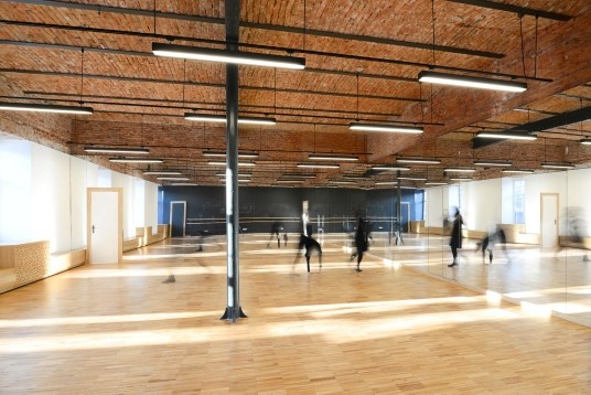
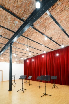
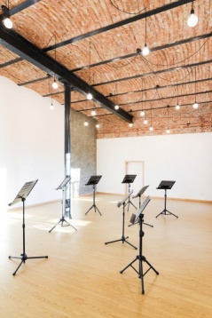
The project aims to uncover as much of the building’s essence as possible and to adapt it to its new program and its beneficiary’s needs. The team was responsible for the many interiors of of the school’s themed spaces. Out of these spaces, the Fashion studio and the Choreography studio are featured within RDW 2017.
2016 // SPATJ Refurbishment
The project unfolds the refurbishment of a 1886 building with a ca. 1970s extension. Their project aims, thus, to uncover as much of the building’s essence as possible and to adapt it to its new program and its beneficiary’s needs. They’ve added features such as, but not limited to: a new fountain, a weather resistant steel pinion that marks the now inexistent limit between the historic building and the 70s addition,structural interventions at the attic level in order to support two new education spaces, a weather resistant steel clad ‘tower’ that hosts a new stair and attic’s HVAC systems. They’re also responsible for the interiors of 7+1 of the school’s themed spaces.


