HISTORY
Diana Barbu is a curious, self-taught illustrator who is currently working and living in her hometown Târgu Jiu, Romania. Her style is influenced by her love for mid-century design, exotic plants, vibrant colours and the universe itself. Diana’s work includes various projects such as children’s books, packaging design, editorials and many more.
ROMANIAN DESIGN WEEK APPEARANCES
2018 // Hop Hooligans
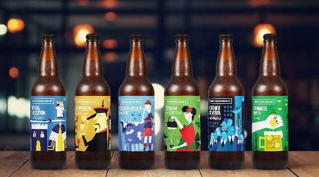
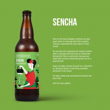
Hop Hooligans is a microbrewery founded in 2016 in Bucharest that produces high quality and mouth-watering craft beer. Their ongoing series of products consists of 30 flavorful beers and counting.
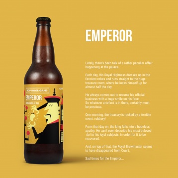
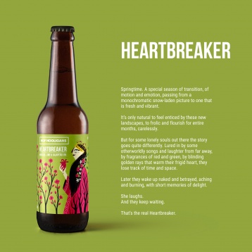
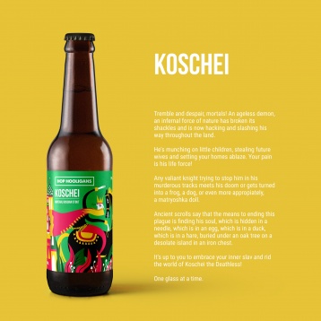
Elements of their playful and cheeky in-house culture, the fun and quirky stories the team wrote about each beer and the name itself were used for designing the labels. The characters are treacherous and bent on making mischiefs. The style of illustrations is sharp, fresh and vibrant with a devilish tint. Everything from the grunge texture on the background, the stories, the nasty characters and their hidden agenda to the beer titles is meant to back up the brand name.
This project has gained reputation with prestigious design publications and has been featured in:
• Lurzer's Archive 2017/18 "200 Best Packaging Design"
• Novum World of Graphics July 2017 Issue
• Chois Gallery Vol. 39
• Favourite Design Annual 2017


