HISTORY
Graphomat is a design studio based in Bucharest, Romania, created by Andreea Mihaiu (graphic designer), Andra Pavel (product designer) and Mihai Popescu (textile designer).
SPECIFIC
Their activity spreads across many branches of design (graphic design, book design, visual identity, manual bookbinding, curating).
2017 // Romanian Constitution
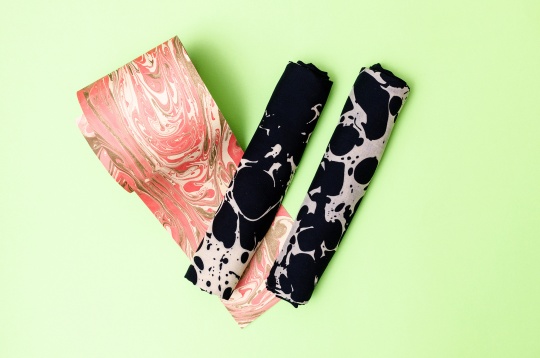
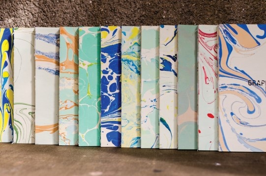
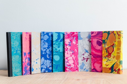
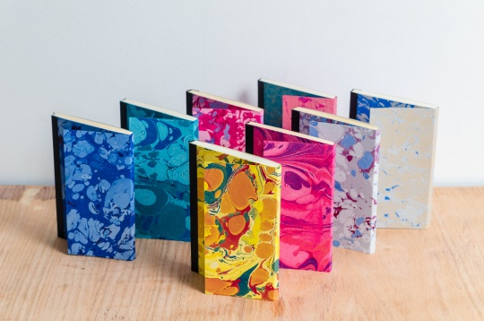
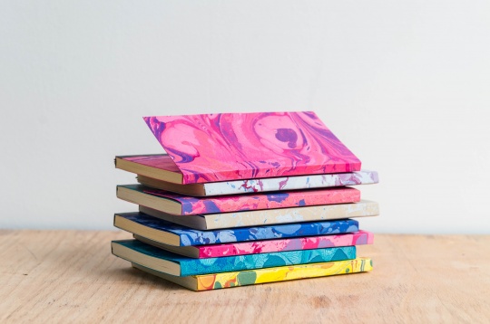
2016 // MARBLED PAPER. MARBLED SKETCHBOOKS
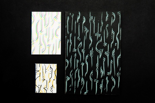
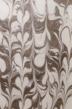
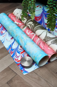
A project that brings to life the marbled paper of 1800. Paper marbling is a method of aqueous surface design, which can produce patterns similar to smooth marble or other stone. The patterns are the result of color floated a viscous solution and then carefully transferred to an absorbent surface, such as paper or fabric. The printed paper is then used as a writing surface for calligraphy, and especially book covers and endpapers in bookbinding and stationery. Part of its appeal is that each print is a unique monotype.
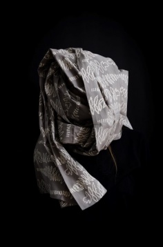
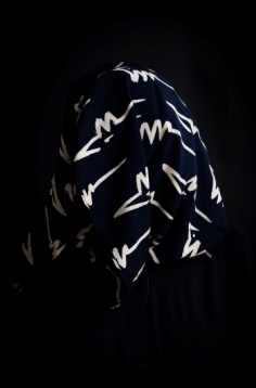
2016 // SCREEN PRINTED SCARVES
Graphomat is a design studio based in Bucharest, Romania, created by Andreea Mihaiu (graphic designer), Andra Pavel (product designer) and Mihai Popescu (textile designer).
SPECIFIC
Their activity spreads across many branches of design (graphic design, book design, visual identity, manual bookbinding, curating).
ROMANIAN DESIGN WEEK APPEARANCES
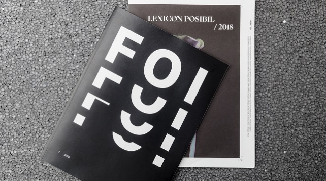
2019 // FOI magazine / 1st Issue
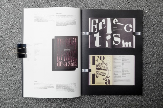
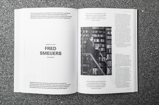
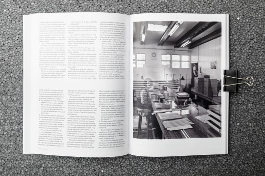
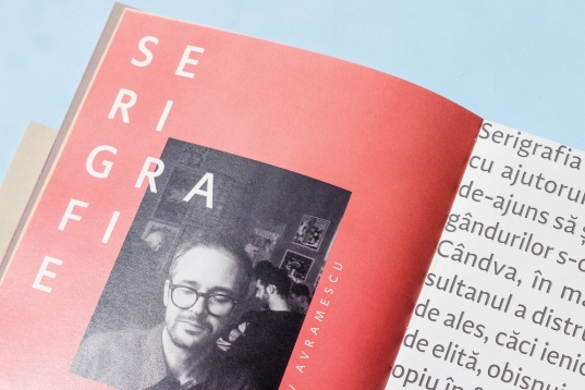
FOI, a new graphic design magazine with and about the people behind every book: illustrators, type designers, graphic designers, photographers, print makers such as: Nicoleta Radu, Fred Smeijers, Frédéric Tacer, Sabina Chipară, Alice Stoicescu, Andreea Dobrin-Dinu, Mihai Barabancea. The project encourages young designers and editors by creating an insert, the first issue being designed by Alice Voinea (MA graphic design, UNArte) with text by Daria Nedelcu (MA History and Art Theory, UNArte).
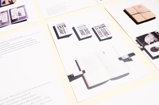
As readers, we do not pay attention to a books aspect; not notincing, we like its binding, its typesetting, the relationship between text and image or just find it easy to read. But, not all books are like this, sometimes we pick up books that have a unsuitable format or they are hard to read. While there is a set of rules a designer has to follow when working on any project, they are usually unknown by the larger audience.
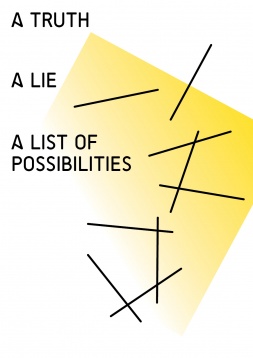
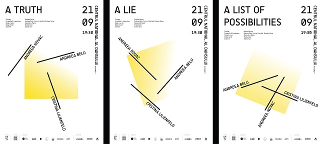
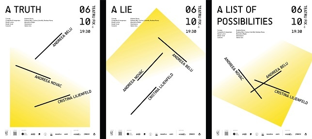
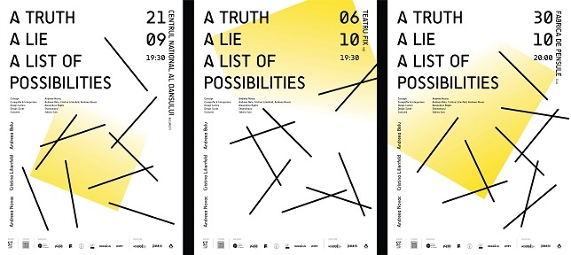
2019 // A truth, a lie, a list of possibilities - dance performance
A truth, a lie and a list of possibilities is the first performance from the trilogy
Beauty – Disgust – Utopia, in which choreographer Andreea Novac turns her attention to beauty, understood as a communication experience or as an act of discovery, bare of esthetical promises.
„I don’t treat beauty as an object or as an esthetical quality, but more like a specific interaction between the spectator and the performer, which implies a transfer of power, a transformative experience, always unstable, enthralling and releasing at the same time, a reason for which, often, gives us lots of trouble” - Andreea Novac
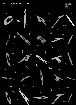
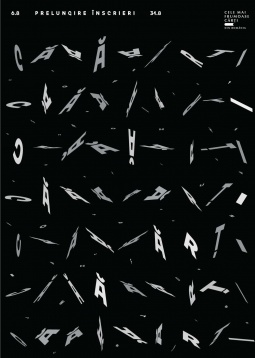
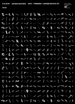
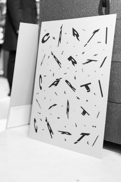
2019 // CMFC visual identity
The most beautiful books from Romania competition, now at it's seventh edition is a cultural project that focuses on the visual dimension of the book and has managed to restore the importance of book design in relationship with the reader. The project creates a platform of dialogue and debate for both professionals and the large public. It also creates an opportunity for national and international recognition and exposure for professionals in the editorial field, designers, artists, illustrators and others.
CMFC = competition, research, magazine, exhibition.
This year's visual identity was focused on the Letter, with a sleek minimal approach. All black and white, an alphabet soup in brownian motion, the visuals deliver the message: it's all about the books; the most beautiful books; boooooooks.
2018 // Catalog - Best Romanian book design 2017
Visual identity for the Best Romanian book design 2017. The concept was based on the idea of playing cards. The catalogue presents the winners and the nominees.
2018 // Illustrated Romanian constitution - middle school
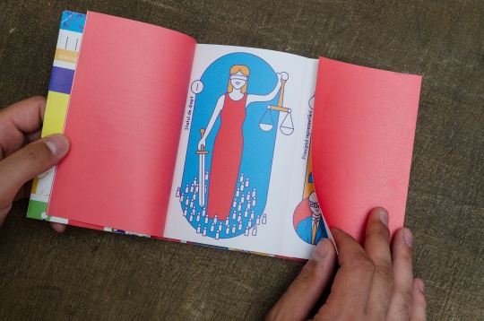
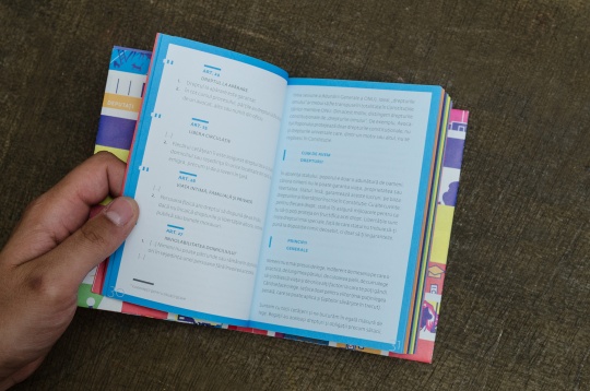
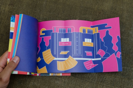
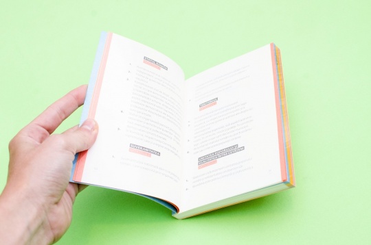
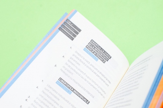
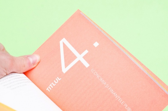
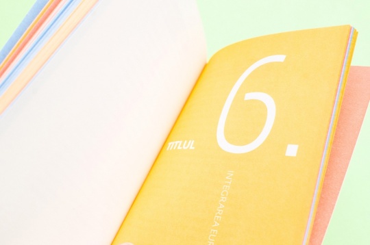
The book is 2 in 1, on the left side there are quotes from the Constitution and on the right side, explanations, being structured in 9 chapters. Each chapter contains a specific illustration.
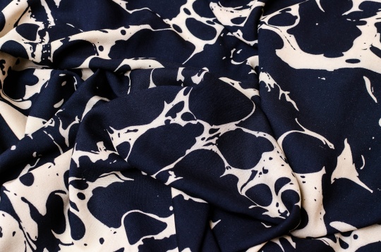
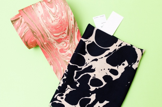
2018 // Marbled scarf
The marbled scarf is inspired by our project “marbling paper” used for notebooks covers. The design is an interpretation of one of our papers and screen printed on textile.
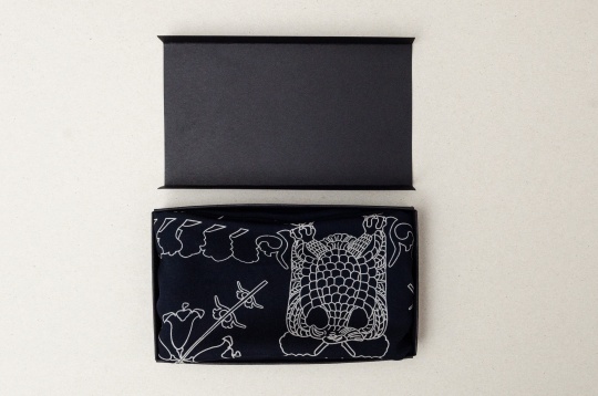
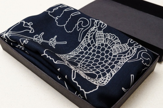
2018 // The royal scarf - winner of the Cotroceni creative contest
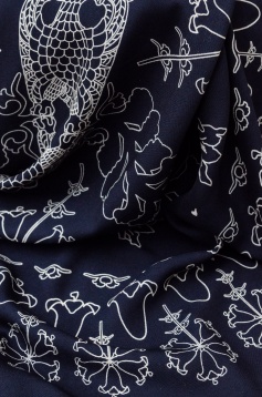
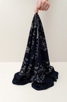
The scarf brings together craftsmanship and contemporary design. It embodies the qualities of both a souvenir and a fashion accessory and, at the same time keeping an aesthetic connection to the Cotroceni Museum. The design features key symbols such as the tree of life and the eagle, present as ornaments on the chairs in the royal dining room as well as Queen Mary's lilies.
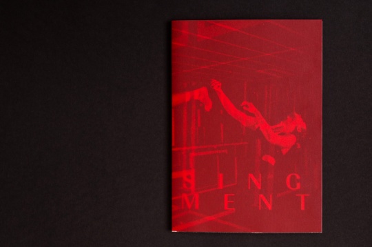
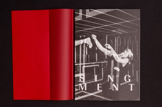
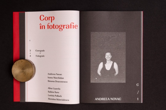
2018 // Exposing movement
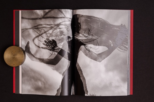
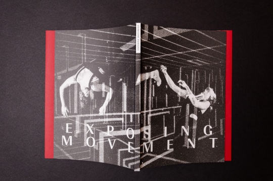
Exposing movement is an artistic laboratory researching analog photography in relation with movement, gesture and the human body. The book goes through the whole process of analog photography, putting technical specs, details, explanations, impressions and images in a friendly and more accessible manner.
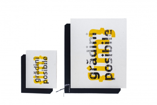
2018 // Grădini {im}posibile
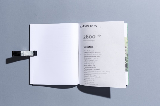
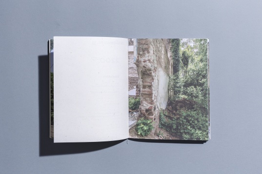
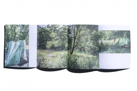
The book is part of the Street Delivery book collection, books binding in the street. Following the SD theme, ”possible gardens”, the book presents a type of garden — frequently seen in Bucharest, that type of unbuilt ground, surrounded by a construction fence on which vegetation has grown in abundance.
Being private, inaccessible, abandoned and ephemeral unites this spaces. The book focuses on the {im}possible gardens, followed by a short list of other types of similar space: accessible or inaccessible, public or private like the well-known "summer gardens".
2017 // Screenprinting
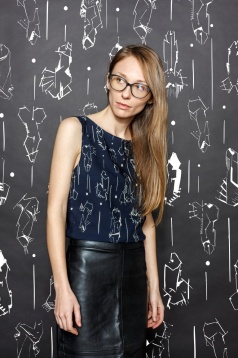
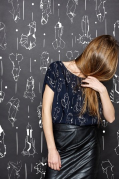
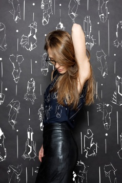
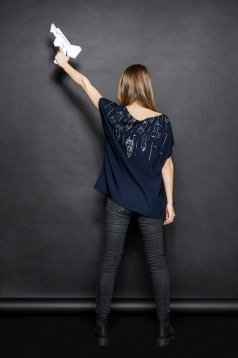
In the screen printing studio, Mihai Popescu creates geometric patterns, plays with forms, sizes, contexts, observing how graphic elements react when they are applied on a soft and mobile surface. This project is called”space invaders”- invasion and attack, an abstract pattern screen printed manually on natural fabric tops (viscose+cotton).
2017 // Stationary
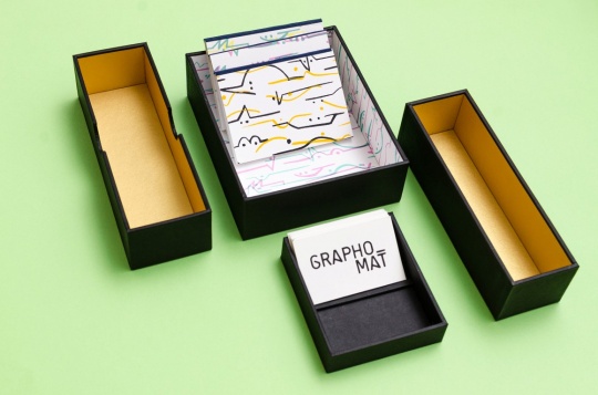
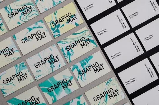
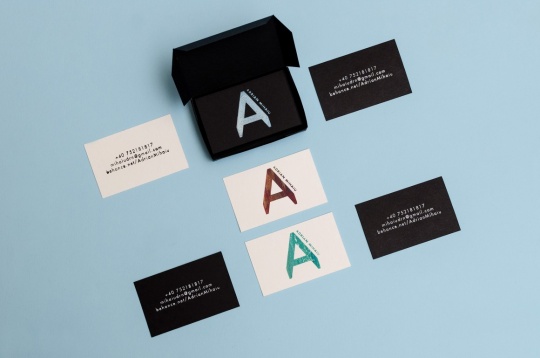
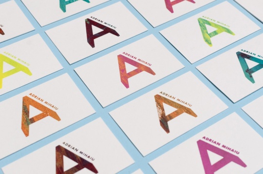
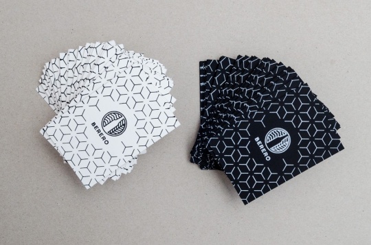
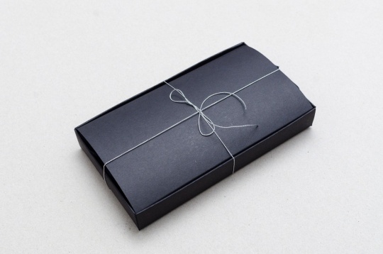
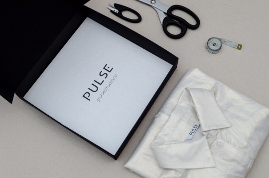
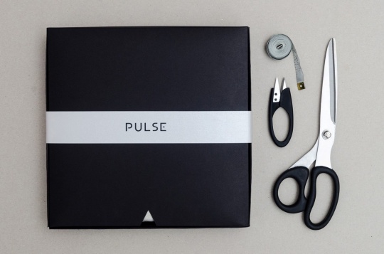
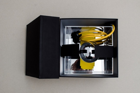
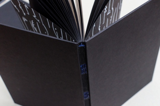
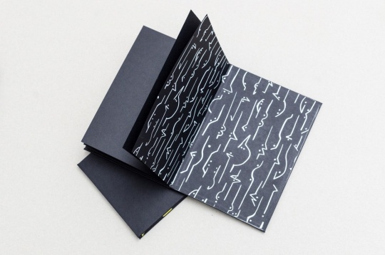
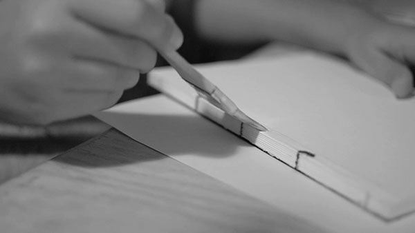
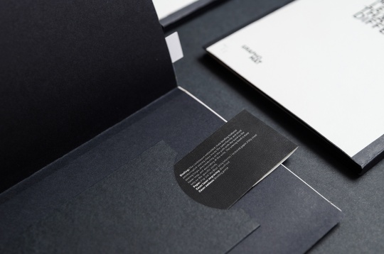
In the stationary side of their studio the team`s members cut, stick, build, sew, pack products like lamps, clothes, wine bottles or shoes for different brands. They like experimenting with paper and exploring new ways to combine materiality and texture. The business card is also a challenge to which they reply by screen printing it, getting a rough and tactile print. The manual bookbinding remain their first love and their most recent product is the black sketchbook.
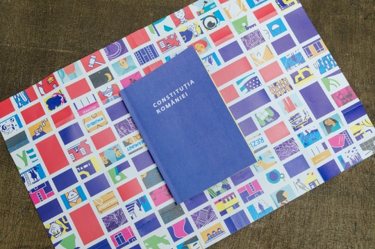
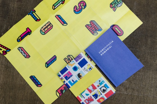
2017 // Romanian Constitution
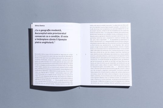
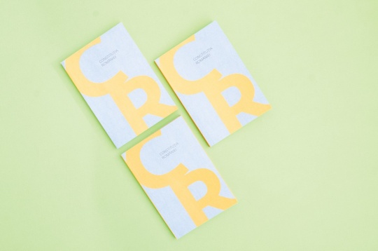
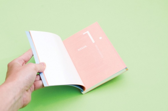
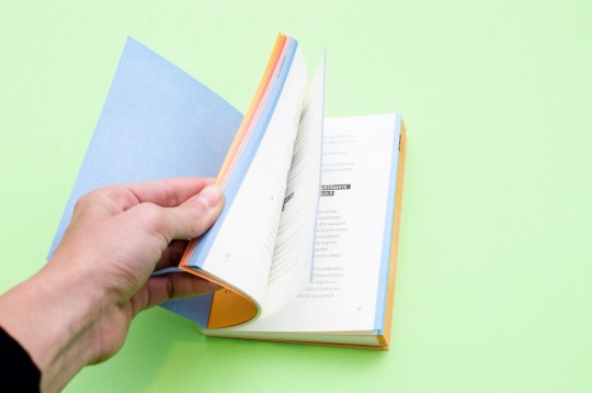
Romanian Constitution is a project initiated by FunkyCitizens and graphically arranged by Grapho_mat. This book needed a new look and so they decided to use a clear layout and soft colors printed carefully by DexterPrint on a special paper.
2017 // Ateliere SD (Street Delivery)
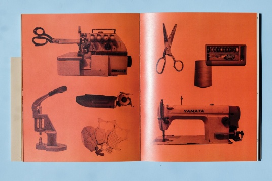
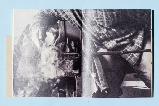
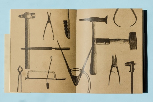
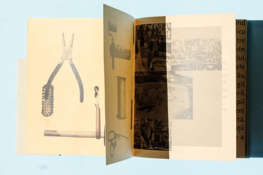
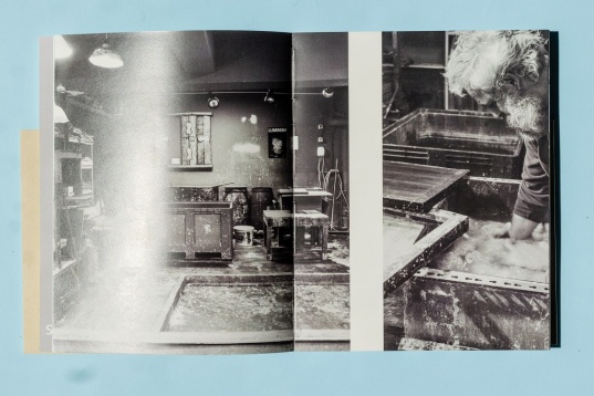
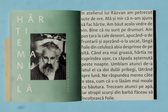
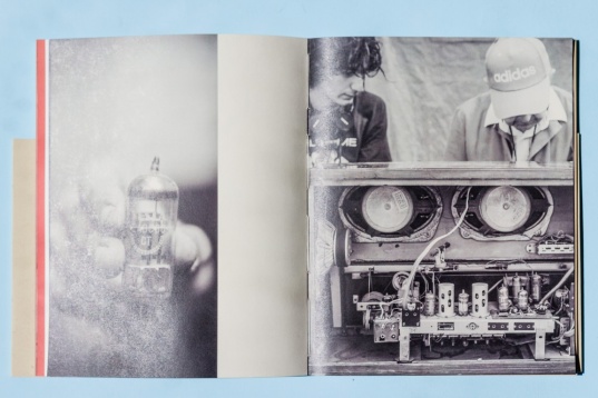
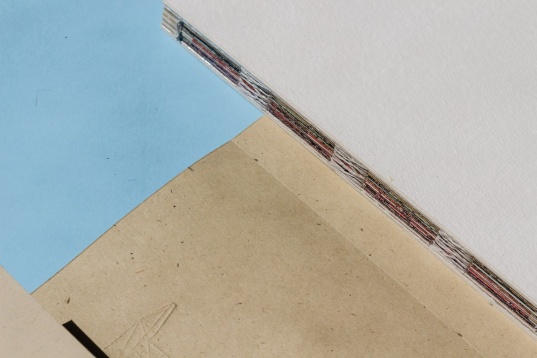
SD Workshops (Street Delivery) album started as an urban collaborative project between Grapho_mat studio and Atelierul de Grafica, at Ciprian`s Isac initiative. A project done in one week (concept, photos, texts, layout, print, binding), the team`s members visited 12 workshops from Bucharest where they took pictures to illustrate their activity. The texts were written by Calin Torsan in his funny way and that`s the reason why they are so in your face. The binding was made in the street after Fabrik printed carefully the special papers.
A project nominated at Cele mai frumoase carti 2016.
2016 // REVIVAL EXHIBITION
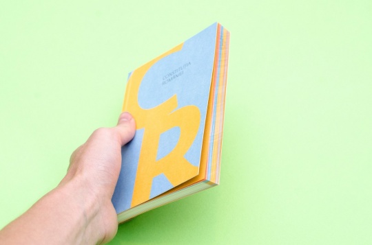
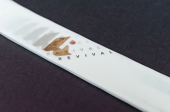
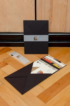
Visual identity for Dorina Horătău (textile designer) personal exhibition, REVIVAL @ Casa Ion Mincu, Bucharest, 2014. After long talks with the artist, it was decided to use the letter R as the exhibition central element, an R that became ornamental, a mix between tradition and contemporanity. Based on the new identity they developed a series of folders describing the event, next to the invitation, outdoor banner, online and print poster and the whole event packaging.2017 // Ateliere SD (Street Delivery)
SD Workshops (Street Delivery) album started as an urban collaborative project between Grapho_mat studio and Atelierul de Grafica, at Ciprian`s Isac initiative. A project done in one week (concept, photos, texts, layout, print, binding), the team`s members visited 12 workshops from Bucharest where they took pictures to illustrate their activity. The texts were written by Calin Torsan in his funny way and that`s the reason why they are so in your face. The binding was made in the street after Fabrik printed carefully the special papers.
A project nominated at Cele mai frumoase carti 2016.
2016 // REVIVAL EXHIBITION
2016 // MARBLED PAPER. MARBLED SKETCHBOOKS
A project that brings to life the marbled paper of 1800. Paper marbling is a method of aqueous surface design, which can produce patterns similar to smooth marble or other stone. The patterns are the result of color floated a viscous solution and then carefully transferred to an absorbent surface, such as paper or fabric. The printed paper is then used as a writing surface for calligraphy, and especially book covers and endpapers in bookbinding and stationery. Part of its appeal is that each print is a unique monotype.
2016 // SCREEN PRINTED SCARVES
Working with fabric, both aim and challenge were for each team member to relay their graphic style onto textiles through screen printing. The focus was thus set on pattern design and how graphic elements look, feel and behave when applied to a soft, moving surface, as opposed to hard paper or print. The result is a series of patterns, designed to be multipliable and appliable to more than one textile surface. The showcase for this project is the series of screen printed scarves, whereas the patterns are intended for future use such as drapes, home textiles, furniture fabric, fashion and so on.
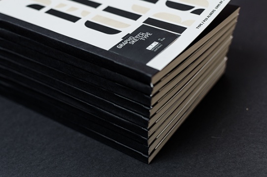
2015 // GRAPHO_SKETCH_TYPE
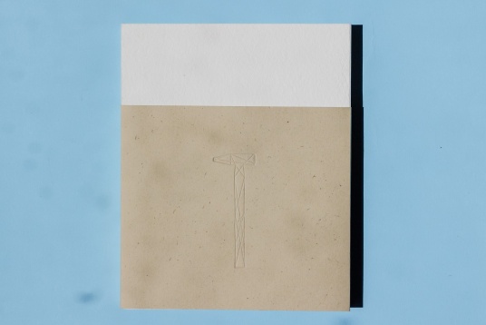
GRAPHO_SKETCH_TYPE is a series of 10 sketchbooks with engraved and printed covers, containing the most popular typographers letters. These sketchbooks are hand sewn and binded. The paper used is Olin Rough Cream 100g, perfect for pen, style or liner writing.
2015 // GRAPHO_SKETCH_TYPE
GRAPHO_SKETCH_TYPE is a series of 10 sketchbooks with engraved and printed covers, containing the most popular typographers letters. These sketchbooks are hand sewn and binded. The paper used is Olin Rough Cream 100g, perfect for pen, style or liner writing.


